
A flat map has to stretch something
Greenland looks so big on a Mercator map because that projection enlarges areas more and more towards the poles. Greenland sits far north, so it gets a particularly generous helping of extra map space.
A projection is a way of putting Earth’s curved surface on a flat page. You cannot flatten the whole world while keeping every size, shape and distance correct.
This is not a fault shared equally by every rectangular map. Different projections make different compromises.
Is Greenland really as big as Africa?
No. Africa has roughly 14 times Greenland’s area. On a Mercator world map they can look surprisingly similar in size. The United Nations uses this comparison to illustrate the distortion.
Think of fourteen equally sized pieces of paper for Africa and one for Greenland. That is an area comparison, not a claim that fourteen Greenland-shaped cut-outs would fit neatly inside Africa’s coastline.
Which map should you use?
For comparing sizes, choose a globe or an equal-area map. “Equal-area” means relative areas stay correct; it does not mean every country has the same size. Shapes may look stretched or unfamiliar.
Mercator has a different strength: a straight line represents a route with a constant compass bearing, which made it useful for navigation. That does not automatically make it the shortest route.
The US Geological Survey’s guide to projections explains the trade-offs. The useful question is: what do you want this map to show?
Compare a globe with a Mercator map
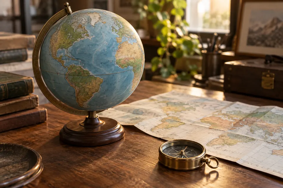
Find Greenland and Africa on a globe, then on a Mercator world map. Compare their apparent sizes. Repeat with an equal-area map: the outlines can change, but Africa should remain much larger.
Does an equal-area map preserve every country’s shape too?
No. Preserving relative areas and preserving local shapes are different goals. A flat world map cannot preserve everything at once.
Another map that refuses to follow neat lines is the world time-zone map. Its bends have a different explanation.